Part 1
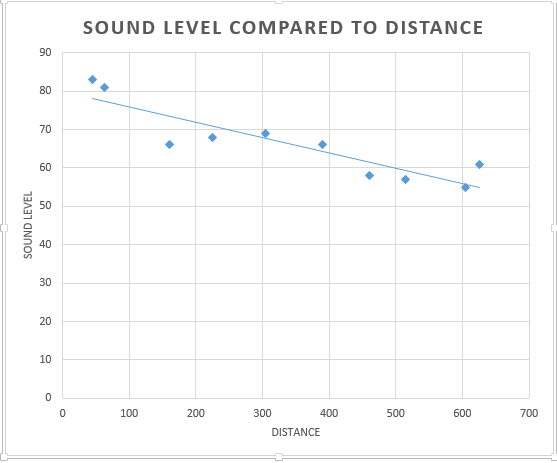
D. The hypothesis is that as distance from a given point increases the sound level decreases.
E. Based solely on the data the hypothesis would be accepted. The data has a correlation of -.896 menaing that the data has a negative correlation and the trend line will then be a downward slope. With the correlation of the data being so close to 1 that means that the correlation is a very strong one
2.

In this correlation matrix it is examining the relationships between poverty, ethnicity and whether they walk or not. With this views the areas that are predominately Caucasian have a strong negative relationship with the below poverty column meaning that for the most part they are not below the poverty line. Though based on this matrix areas that have a significant positive correlation with being below the poverty line, meaning that areas that have a high minority population also have a high incidence of poverty. With the walking column all races correlate siggnifcantly meaning that there is no assumption that can be made that one race is more prone to walking from this matrix and dataset.
Part 2
Introduction
With this part of the assignment the task was given to analyze patterns in voting and turnout for the state of Texas. The output data for this is intended to be presented to the governor to analyze if election patterns have changed over the past 20 years. To do this analysis multiple spatial and statistical analysis programs were required to be used, those being ARCMAP GeoDa and Excel. Some of the ways the data will be anyalyzed is through correlation and spatial auto correlation ( correlation of a variable with itself through space ) analysis. The data that is being analyzed is voter turnout for both the 1980 and 2008 elections, Percent Democratic vote for both the 1980 and 2008 elections and percent Hispanic population for 2010 based on the 2010 census.
Methods
For analysis the data was provided in the Assignment 4 folder but one section of data required downloading from the US Census website and that was the 2010 Hispanic population data. The shape file was also required to be downloaded from the US census website so the data could be properly connected to the correct counties. The only problem with the data is that the data downloaded from the census was not in the same table as the data that was provided in the assignment 4 folder. The way to fix that problem was to take the percent Hispanic population data from the downloaded data and copy it into a new column within the data that was provided to us in our folders.With these two sets of data and the shape file of Texas counties it was time to utilize ARCMAP. In ARCMAP is where the data tables were joined to the counties shape file based off of the Geo_ID column. Now that the table was joined with the shape file it was ready to by put into GeoDa so that the data could be analyzed using spatial autocorrelation and making a LISA map (Local indicators of spatial autocorrelation)
Results
 |
| Figure 1 Percent Democratic vote 1980 |
 |
| Figure 2 Percent Democratic vote 1980 LISA |
 |
| Figure 3 Percent Democratic vote 2008 |
 |
| Figure 4 Percent Democratic vote 2008 LISA map |
 |
| Figure 5 Percent Hispanic population 2010 |
 |
| Figure 6 Percent Hispanic population 2010 LISA map |
 |
| Figure 7 Voter turnout 1980 |
 |
| Figure 8 Voter turnout 1980 LISA map |
 |
| Figure 9 Voter turnout 2008 |
 |
Figure 10 Voter turnout 2008 LISA map
|
With election data one of the first things the is helpful to look at is the turnout or where the people voting are actually coming from. This is analyzed with figures seven through ten. Figures seven and eight show the voter turnout for the 1980 election. From the Moran's I it can be see that a majority of the data falls in the center of the plot but there are outlier data value. When looking at the areas of high concentration the high voter turnout is generally located in the north of Texas and the areas of low voter turnout are located to the south of the state. The same trend can be said for the the 2008 election though there is a visible shift here with the areas that are high and low voter turnout seemingly decreasing or shifting with the areas that were previously low voter turnout in the south of Texas beginning to trend to a higher turnout. The opposite can be said for the north where high voter turnout was previously found with those areas becoming normalized or shifting to a low high correlation. The second big thing to examine is what party these voter are casting their ballots for. Historically Texas is know as a republican state, and examining figure one confirms that with the areas of high democratic votes being minimal and the areas a of low democratic votes being very high. But comparing it to the 2008 data another interesting comparison can be made though the amount of counties that were before considered to be strong republican voting counties may be the same the number of counties that are voting strong democrat are actually increasing. This is really important when comparing it to voter turn out since in the LISA map for the 2008 election shows that the areas that are beginning to trend to being high voter turn out counties are also the counties that are voting predominantly democrat. Through all this analysis there has been a visible shift in voting trends in the state of Texas. Voter Turnout has begun shifting with norther counties decreasing their presence at the polls with southern counties begining to turn out more. The other big trend shift is the shift from Texas being a predominantly republican voting state to a more well balanced with a rising democratic vote.
conclusions
With this assignment the requirement was to examine Texas voter data for the 1980 and the 2008 elections at the county level. The task was to interpret this data and determine whether any trends are developing noticeably in both voter turnout and which party the vote is cast for. Programs Such as ARCMAP and GeoDa were utilized to compile the data and create LISA maps for the data analysis. Through this data analysis visable trend emerged in the 1980 election high voter turnout was in the north and low turn out was in the south. democratic voters were concentrated in the south. Though in the 2008 election these patterns seemed to start to switch with voter turnout in the north deminishing and the south beginning to increase. This means that potentially Texas could become a state that has a higher proportion or democratic voters than republican if these trend were to continue.

No comments:
Post a Comment